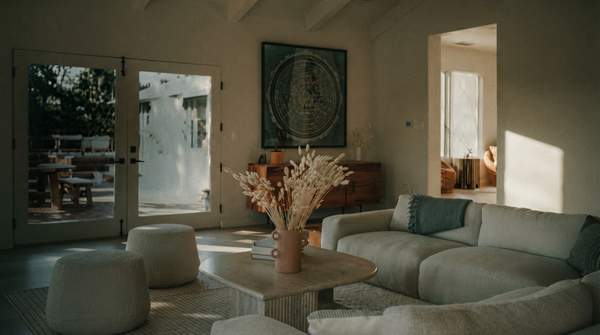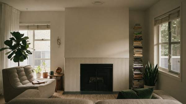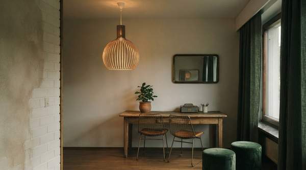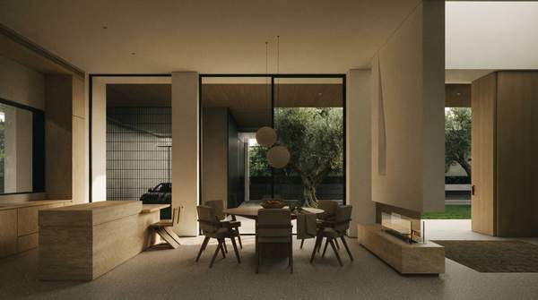
A serene minimalist palette comes down to a simple, repeatable decision: one base neutral, one supporting secondary color, and one sparing accent—then texture to keep it from feeling flat. Designers interviewed by Livingetc converge on a working limit of three colors per room, with Tash Bradley, head of interior design at Lick, advising no more than three colors in a room and six to eight across an entire house. Your job is not to pick colors at random but to assign each one a role.
The Power of a Minimalist Palette: Serenity and Spaciousness
Minimalism in interior design is typically associated with a calm, uncluttered "less is more" aesthetic, as Benjamin Moore's style guidance puts it—and today's version has evolved beyond merely clutter-free rooms toward soothing comfort. The palette that supports this mood is deliberately narrow: crisp whites, warm neutrals, and soft grays used in abundance, with subtle pops of color woven in for personality.
The reason a limited palette feels spacious is visual continuity. When a room's surfaces echo the same quiet family of hues, the eye rests rather than hunts. Subdued whites, grays, and beiges create exactly that calm, uncluttered atmosphere, while deeper saturated hues like black, navy, and forest green can still read as sleek and sophisticated within a minimalist frame.
Step 1: Choosing Your Base Neutral for a Calm Foundation
Your base neutral is the dominant color, covering the largest share of walls and major surfaces. The classic minimalist options are white, greige, and gray. Choose by mood: whites feel crisp and airy, warm beiges feel restful, and grays feel sleek.
One refinement worth borrowing: pair a crisp white ceiling with more adventurous wall colors to add perceived height to a room, as Benjamin Moore suggests. If your base is white, this move costs you nothing in calmness while making the room feel taller and more open.
Step 2: Introducing Depth with a Secondary Color
Your secondary color supports the base without competing with it. Tom Rutt, founder of TR Studios, describes minimalist interiors as using three or four complementary colors in the same tone—neutrals like grey, taupe, beige, black, and earthy wood tones being the most common. The key phrase is "in the same tone": your secondary should sit beside your base in depth and temperature.
An earthy secondary—taupe, sand, or a wood tone—is the safest companion for a white or greige base. It adds subtle variety while keeping the atmosphere intact. Livingetc's guidance on neutral schemes is that balance and harmony prevent the space from becoming monotonous or overwhelming, and a well-chosen secondary is where that balance lives.