You can make a small room feel dramatically bigger without moving a single wall. The trick, according to designers, is not to pile on every space-saving tip you've ever heard — it's to figure out which specific visual problem your room actually has, and then apply the technique that solves it. A room with low ceilings needs a completely different fix than a room that feels cluttered or dark.
Designers interviewed by House Beautiful describe the unifying principle this way: the key to a larger-looking space is creating visual continuity and avoiding small interruptions that stop the eye. Once you understand what's interrupting the eye in your room, the right fix usually becomes obvious.
Introduction: Unlocking Space in Small Rooms
Most small-room advice fails because it treats every cramped space the same. But a narrow galley living room and a dim basement bedroom have opposite problems. One needs visual flow; the other needs light reflection. Applying the wrong technique wastes money and can even make things worse.
This article walks you through a diagnostic approach. First, you'll identify your room's primary challenge — low ceilings, a narrow footprint, visual clutter, poor light, or furniture that crowds the floor. Then you'll match it to the design principle that directly addresses it, drawing on advice from designers and design writers including home design consultant Alexandra Gater, whose tips were featured by NPR's Andee Tagle, and the designers quoted by House Beautiful's Erica Finamore.
Everything here is visual and non-structural: paint, curtains, rugs, art, and furniture choices. No renovations, no product recommendations — just principles you can apply with what you already own or can easily change.
Diagnosing Your Room's Visual Challenges
Start by standing in the doorway and letting your eye travel naturally around the room. Where does it stop? That stopping point is your problem. If your eye hits a short curtain rod or a low bookcase, your challenge is vertical — the room lacks height. If your eye bounces between many small objects, your challenge is clutter. If the room feels dim even at midday, light is the issue.
Be honest about scale, too. A deep, overstuffed sectional in a narrow room overwhelms it; as designer Joshua Jones of JJones Design Co. notes, simply reducing the depth of a sofa by a few inches can make circulation easier and restore balance. And check your rug: designers consistently report that undersized rugs are among the most common mistakes they see in small rooms, because a small rug chops up the floor and makes the whole room feel smaller.
Most rooms have one dominant problem. Find yours in the framework below and start there.
Diagnostic Framework: Matching Room Challenges to Design Solutions
Use this table to locate your room's primary challenge in the first column, then apply the corresponding technique. The reasoning behind each pairing: every solution either restores visual continuity (letting the eye flow without interruption) or adds a specific visual effect — height, depth, or lightness — that counteracts the problem.
| Your Room's Challenge | Design Principle | Targeted Technique | Why It Works |
|---|---|---|---|
| Low ceilings | Vertical emphasis | Hang curtains high and full-length — long enough to "kiss the floor," per Gater — and choose tall, floor-to-ceiling shelving. | Full-height drapery and tall storage draw the eye upward and remove the horizontal lines that truncate the walls. |
| Narrow footprint | Visual continuity | Paint all walls one color, or color drench — extend the color from baseboards to ceiling. | Removing visual boundaries lets the eye move smoothly across surfaces, so the room reads as larger. |
| Visual clutter | Scale and simplicity | Choose fewer, larger, well-scaled pieces; one large anchor artwork instead of many small ones. | Too many small pieces make a room feel cluttered; fewer, larger pieces create calm and reduce visual noise. |
| Lack of light | Light reflection | Use light, neutral wall colors and place mirrors strategically. | Light colors reflect light, and mirrors create the illusion of depth while amplifying brightness. |
| Cramped circulation | Furniture placement | Reduce the depth of oversized pieces rather than replacing everything. | Trimming a sofa's depth by a few inches makes circulation easier and restores balance. |
| Heavy, crowded furniture | Visual lightness | Swap enclosed bases for pieces with exposed legs and slim profiles. | Seeing the floor extend beneath a sofa or chair makes the room immediately feel less crowded. |
| Chopped-up floor | Anchoring elements | Replace a small rug with a large one that anchors the furniture. | A small rug fragments the floor plan; a large rug unifies the space. |
Pick one or two rows — not all seven. Targeted changes produce the noticeable shift; scattering effort across every technique dilutes each one.
Strategic Color and Light: Expanding Horizons
The single most counterintuitive color advice from the experts: the accent wall is out, at least in small spaces. Painting just one wall a statement color can visually fragment your home, designer Lynch told NPR. Instead, stick with one color or palette across all your walls — and it doesn't matter whether that color is dark or light. "Having that consistency throughout makes a space feel larger and has more impact," she says.
If your walls feel short, take it further with color drenching: extend the wall color from the baseboards all the way to the ceiling. This removes visual boundaries and disguises the lines that would otherwise truncate your walls. Don't fear dark shades — the consistency, not the lightness, does the work.
For genuinely dark rooms, pair those continuous walls with light, neutral tones that reflect available light, and add a strategically placed mirror to amplify brightness and create the illusion of depth.
Smart Furniture and Layout Choices for Openness
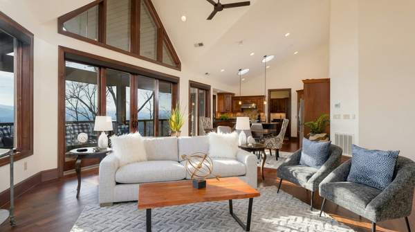
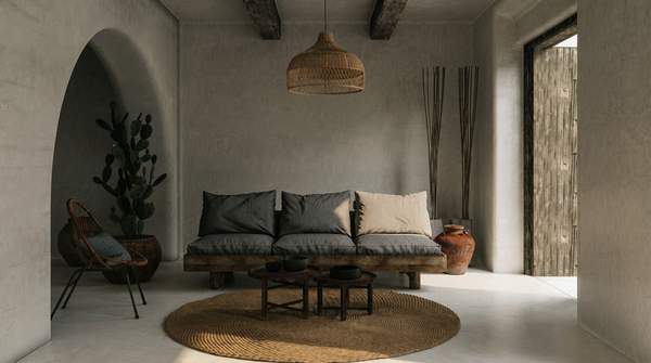
Furniture weight matters more than furniture count. Pieces with exposed legs — raised-leg sofas, open-base accent chairs, slim coffee tables, non-boxy consoles — create openness underneath. When you can see the floor extending beneath a sofa or chair, the room immediately feels less crowded, because your eye registers continuous floor space instead of solid blocks.
Depth is the other lever. Deep, overstuffed sectionals can overwhelm a narrow living room. Jones, writing from his design projects, found that reducing a sofa's depth by a few inches is often enough to ease circulation and restore balance — you don't necessarily need a smaller room's worth of new furniture.
Finally, think vertically. Gater recommends replacing wide, bulky floor lamps with plug-in or battery-operated wall sconces, and mounting standing mirrors on walls or doors. Floor-to-ceiling bookcases and tall storage units free up floor area while pulling the eye upward — a win for both clutter and low ceilings.
Mastering Decor and Wall Art to Create Depth
On the walls, go big. Design writer Jess Bunge, writing for Emily Henderson's design site, built a floor-to-ceiling arrangement around one large "anchor piece" and offers a blunt rule of thumb: avoid too much "bitsy" art, which ultimately makes a room feel smaller and cluttered. A single piece that's properly sized for its wall preserves the balance and scale that make a room look and feel bigger — even when a smaller piece would seem like the "safe" choice for a small room.
Windows deserve the same confidence. Curtains hung high and full-length add vertical rhythm and make windows appear larger. Gater's practical guidance: aim for curtains just long enough to "kiss the floor" — too-short panels look like a measuring mistake, while too-long panels pool and collect dust.
Mirrors remain one of the most reliable depth tools, but placement matters: a mirror works when it reflects light or an interesting view, effectively adding a visual "room" that isn't there.
Counterintuitive Solutions: Avoiding Common Mistakes
Three habits reliably shrink rooms, and each has a surprising fix:
- Mistake: Many small art pieces. A cluster of little frames forces the eye to jump from object to object. Fix: one large anchor piece, sized generously for the wall, with everything else built around it.
- Mistake: A small area rug. Designers say undersized rugs are among the most common small-room errors, because they chop the floor into fragments. Fix: a large rug that anchors most or all of the furniture, unifying the floor plan.
- Mistake: A single accent wall. One statement-colored wall visually fragments the space. Fix: one consistent color on every wall — dark or light — or full color drenching from baseboard to ceiling to erase the boundaries.
Notice the pattern: in each case, the instinct is to go small and cautious, and the fix is to go bigger and more consistent. As House Beautiful's designers put it, sometimes the best way to make a room feel bigger is to stop trying so hard to make it look big.
Transform Your Small Space: A Practical Action Plan
Your decision: identify your room's primary visual challenge and implement one or two targeted techniques from the framework — not everything at once. If your eye stops at short curtains, hang full-length ones. If the floor looks chopped, get the bigger rug. If the walls feel short, drench them in one color.
Because these are visual techniques rather than structural ones, results depend on your specific layout, lighting, and existing furniture — a dark north-facing room will respond differently than a bright narrow one, so treat the framework as a starting diagnosis, not a guarantee.
You'll know it worked by a measurable indicator: the room feels noticeably lighter, less cluttered, and visually expanded, with improved flow and a greater sense of calm. Step back to the doorway after each change and check whether your eye now travels smoothly instead of stopping. When it does, you've solved your room's real problem.